
Popup Widgets Architecture
As the demands of production increase, the demands for what can be accomplished inside any given DCC increase. With each new tool developed, screen real estate becomes more precious. We have hit the point where it is required that users have two monitors to host the large number of windows that a user must have open at any given point in time.
Popup Bar Widgets aims to mitigate this problem, by implementing a technology that predates the modern computer. Popup Bar Widgets in essence are designed to modernize the Picture in Picture (PiP) technology to user interfaces as Window in Window (WiW) displays which will allow users to interact with multiple windows simultaneously.
The reason that this works is twofold. The first reason is simply that a user can only interact with one window at a time. What I mean by this is that there is only one user with one cursor, therefore they can only be actively doing one thing at a time. The second part of the equation is that the single active window only has a handful of other windows that it interacts with. This means, that most of the time, modern interfaces are displaying a significant amount of information that is not relevant to the user's current task.
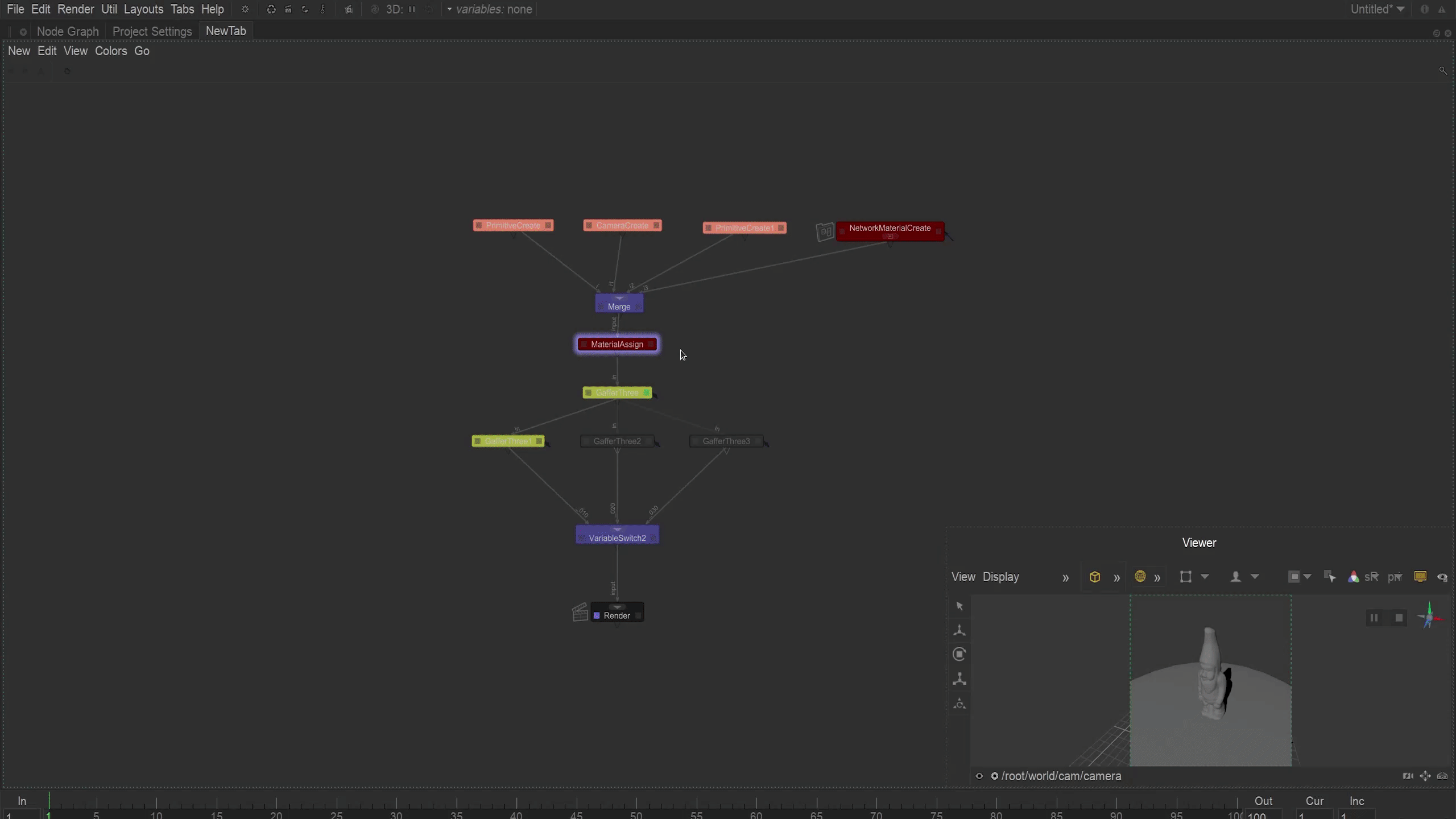
Popup Bar Widgets implements four strategies to allow users to easily access relevant information to their current task while discarding irrelevant information. The general basis for these strategies involves having a popup bar with icons/widgets in it. When the user's cursor enters one of these icons, the window it relates to is shown as a popup. When the user's cursor exits the popup window, the popup window is closed. Additionally, the user has the option to pin the window so that it does not close when the cursor exits. Below we can see a primitive example of these strategies in action.


As we can see, there are essentially four different strategies that can be used to embed these windows into each other. Two of these (WiW mode with multiple windows, and WiW Taskbar mode) are not that important to us as most of their functionality is covered by Tab Widgets. However, there are a few exceptions here as some basic quality of life handlers have been implemented in all Popup Widget display modes, such as:
-
The ability to place the popup bar on any side of the window.
-
Swap the main viewing window with the previous or currently active one with < space >
-
Swap the main viewing window by index with < 1, 2, 3, 4, 5 >
-
Hide the popup bar widgets < q >


Where it starts to get a little more interesting is with the standalone mode and the WiW mode with a single window. We'll start with the WiW mode, as it essentially has a 1:1 relationship with the original PiP concept.
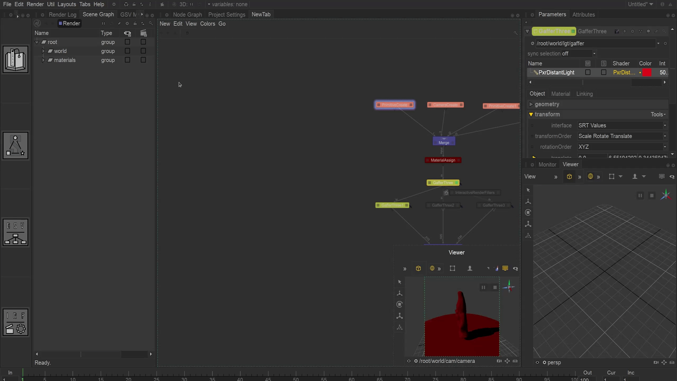
In this mode, the user can clearly see both windows simultaneously. A great use case of this type of mode can be seen below, where we can see a node graph and a render view being swapped with each other to allowing the user to easily work in the node graph, and then check their renders.
The next interesting part of this is in standalone mode. This mode essentially allows users to create a hotspot in their interface for utility tabs. Below is a simple example of a use case for this showing how we can create a panel of utility tabs for the user to easily access to adjust arbitrary data points in a DCC.
However, as you can probably tell by now, we have a dilemma. The issue is that there are far too many combinations of DCC/windows for the developer to be able to define for the user. Not to mention, the fact that there are multiple different workflows inside of each DCC depending on discipline and subtask of the discipline. This is where the Popup Bar Widget Designer comes into play. The Designer plays an important role, as it defers this power to the users to be able to define their own interfaces for their specific DCC or workflow of choice.
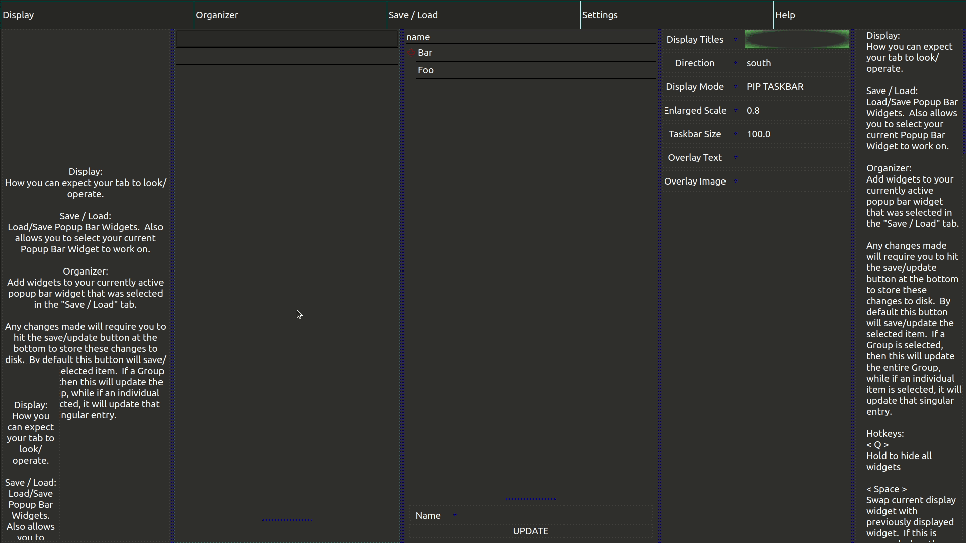
In the image below, we have a Popup Widget Designer that has all of its tabs opened so that we can get a closer look at it. There are four main tabs that are worth noting, which are:
-
Display: What the interface will look like.
-
Organizer: Where you can determine what windows will be available in the Popup Bar
-
Save / Load: Allow users to save / load interfaces. Clicking on an item here will automatically load it into the organizer.
-
Settings: All of the settings that can be set for the display mode currently selected.
Please note that since this inherits from the Shoji Architecture, each tab can easily be minimized/maximized depending on the users current task.
A great example of the Popup Widgets Architecture can be seen below in the Popup Tabs tool. In this video, we can see the entire process in action from creating an interface to using one that has already been set up.

Copyright © 2022 Brian Fukushima. All rights reserved.